|
typeworkshop.com home : type-basics : references : archive |
mailing list |

| type basics |
100% practical. Sketches have been made to explain some basic issues in type design during the workshops. They get used to point out some problems which raise while creating a new typeface. Only some foundations are shown, no deep sophisticated details.
Any suggestions? Let us know.
[Type-basics in hungarian] : [Type-basics in spanish] : [Type-basics in german]


 |  picture 10 of 19 |  |
|
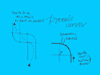
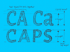
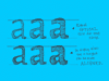
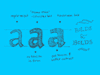
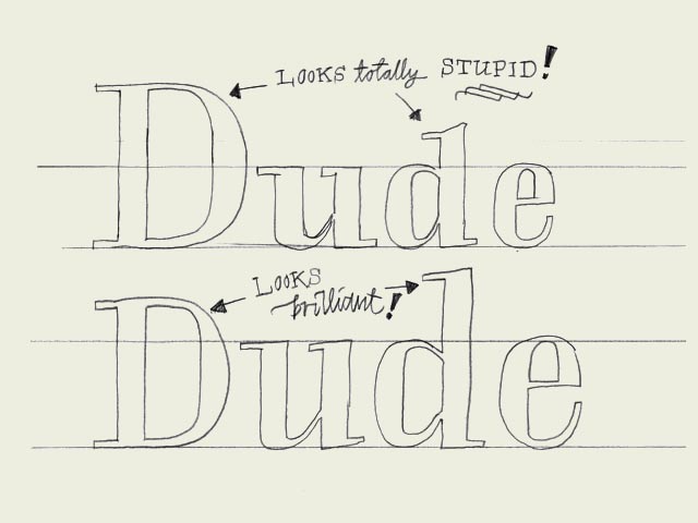
Proportions. Which x-height to define? Which descender depth? Defining these proportions are essential, and very strongly connected to the purpose of the type. The proportions within a certain typeface are influencing the way your type will work & look. For example, it's
impossible to create a space saving newspaper typeface with an extremely wide body width. Extremely short descenders will give a strange look to a text typeface. Even worse, they might not be visible at all anymore. But extremely short descenders can also be a smart decision, while creating a display or headline type. For a text typeface the ascender height should be as big or, even better, bigger than then cap height to give a optical pleasurable result (see drawing). | |
 background information :
I have a question :
contact : browse :
site-map
background information :
I have a question :
contact : browse :
site-map |