|
typeworkshop.com home : type-basics : references : archive |
mailing list |

| type basics |
100% practical. Sketches have been made to explain some basic issues in type design during the workshops. They get used to point out some problems which raise while creating a new typeface. Only some foundations are shown, no deep sophisticated details.
Any suggestions? Let us know.
[Type-basics in hungarian] : [Type-basics in spanish] : [Type-basics in german]
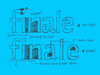
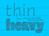
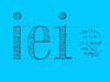
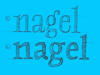
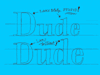
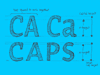
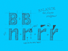
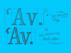
 |  picture 1 of 19 |  |
|
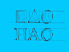
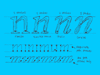
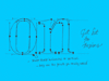
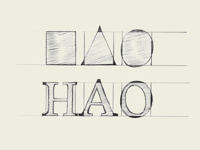
Same size for all! To optically align all characters on a line, they cannot not have exactly the same mathematical height. For example the triangle on this drawing has to be higher than the rectangle. If this is not the case, the triangle will for sure look smaller than the rectangle. While creating a typeface, you want all the letters to have the same height. Also round forms have to exceed the baseline to be optically the same. If the circle would have exactly the same mathematical height as the rectangle, it would look smaller than the square. This doesn't only count for basic forms like triangles, circles and squares. It's essential in type design, because they apply to every single character in a typeface. Then it even doesn't matter if you're designing a latin, cyrillic or greek font. It's a basic principle for any kind of shape. | |
 background information :
I have a question :
contact : browse :
site-map
background information :
I have a question :
contact : browse :
site-map |