|
typeworkshop.com home : type-basics : references : archive |
mailing list |

| type basics |
100% practical. Sketches have been made to explain some basic issues in type design during the workshops. They get used to point out some problems which raise while creating a new typeface. Only some foundations are shown, no deep sophisticated details.
Any suggestions? Let us know.
[Type-basics in hungarian] : [Type-basics in spanish] : [Type-basics in german]


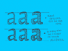
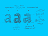


 |  picture 3 of 19 |  |
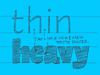
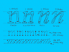
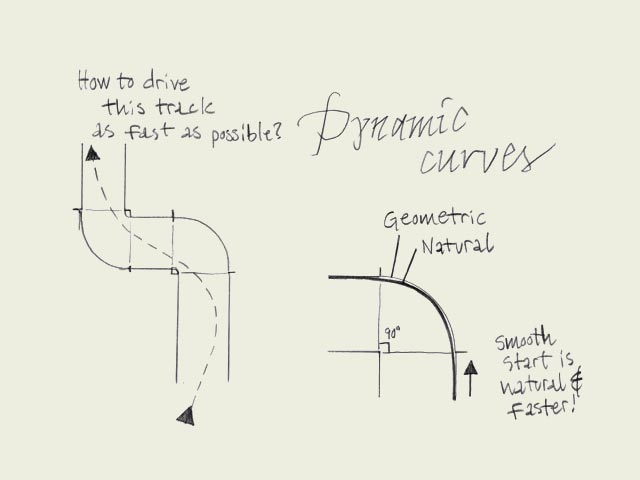
| Fluent shapes. Designing type is like driving a car. If you drive a car, you always take the curve in a natural way. If you draw a curve (of a character) on paper, this is exactly the same. The curve starts smoothly, never out of a sudden. While driving a car, you don't start turning the wheel when you are already in the beginning of the curve. A while before you arrive in the curve you anticipate by leading your car gently in the right direction. Think about driving a car when you are sketching type on a paper. | |
 background information :
I have a question :
contact : browse :
site-map
background information :
I have a question :
contact : browse :
site-map |