|
typeworkshop.com home : type-basics : references : archive |
mailing list |

| type basics |
100% practical. Sketches have been made to explain some basic issues in type design during the workshops. They get used to point out some problems which raise while creating a new typeface. Only some foundations are shown, no deep sophisticated details.
Any suggestions? Let us know.
[Type-basics in hungarian] : [Type-basics in spanish] : [Type-basics in german]


 |  picture 6 of 19 |  |
|
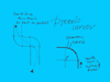
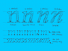
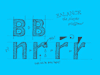
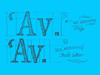
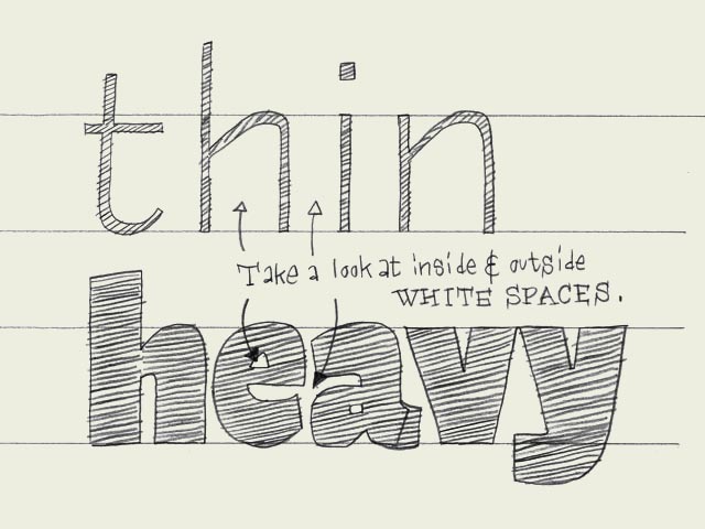
Black vs. white. Designing type is nothing more and nothing less than harmonizing black and white shapes. Black can't exist without white, and white can't exist without black. Black, the shape of a letter.
White, the space in or in between letters. The amount of white inside a character defines the amount of white in between two characters. As it is impossible to create a very black character with a big (white) counter form, a black typeface will always have smaller counters than a light typeface. Hence it follows that there is less space in between the characters (see drawing). A light typeface has much bigger counters. The space in between two letters has to be in proportion. As a consequence there is more white space in between light letters than in between black letters. | |
 background information :
I have a question :
contact : browse :
site-map
background information :
I have a question :
contact : browse :
site-map |