|
typeworkshop.com home : type-basics : references : archive |
mailing list |

| workshops, Helsinki Lahti 10 2002, 07 |
pts. publication basic info : presentation half way :
 |
Assignment
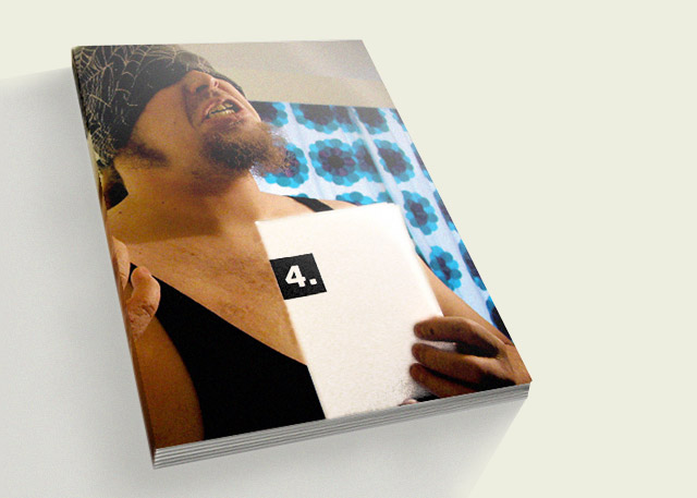
The result of the this workshop was this Pts. publication. Our group's job was to define the whole idea for this publication, be the editor and be the designer. Anything was possible, although the workshop had to be the main content of the publication.
Process
We started by defining the content and way to show it in the publication. The most important aspect was how to find an interesting way to present the workshop-projects. From the beginning it was clear that we need a strong concept for the publication, the workshop projects would not be the only content.
In the first few days we created many ideas. But we rejected them because they were too design-centered and might appeal to a too narrow audience. The goal from the beginning was to make the publication for the broad audience, not only for graphic designers. One of the most important factors in creating the concept was the structure of the workshop. We had to create a concept that would allow us to create the publication during the workshop, before any of the typefaces were ready to be used.
Final solution
Finally we came up with a concept for a publication about nothing. The original idea was to present different situations and media where type is essential for communication. The publication would consist only of pictures.
We started to gather pictures removing all text from them. We quickly realized that many of the pictures were not effective enough or emotionally appealing. We decided to concentrate on pictures with people who have a strong need to get their message through. The problem was how to combine our concept and the projects from the workshop. Our visual concept and the presentations of typefaces didn't fit together naturally. Communicating with type contradicted the concept of removing the written messages from the pictures. We also wanted the inside pages to have one strong visual unity and not cut the flow of the pictures with spreads with text. From early on the idea of leaving some parts to be discovered appealed to us. We didn't want it to be obvious from the first look at the book that it was about a type design workshop. To hide the spreads where the type is presented seemd a good solution.
To get variety in the presentation of the material we decided to mimic different media in the publication. The chosen media and the layout of the pages are related to the style and content of the pictures.
We feel the publication has a clear and strong concept, and hope it appeals to a broad audience.
You will find more info about the book and purchase options on the website of Nijhof en Lee booksellers in Amsterdam.
 background information :
I have a question :
contact : browse :
site-map
background information :
I have a question :
contact : browse :
site-map |