|
typeworkshop.com home : type-basics : references : archive |
mailing list |

| workshops, Vienna 04 2004, daily |

assignment |
|
|
|
This website will be updated during the workshop. Follow it live on this spot.
Twelve groups of students and twelve approaches to speech - quite a versatile collection. Working on a font for one week is just an introduction, but here's a whole bunch of potential concepts to keep on working with. Thanks for Titanic-Club's excellent live music and for Typographische Gesellschaft Austria, who made all this happen. Long live TGA!
 |  picture 4 of 36 |  |
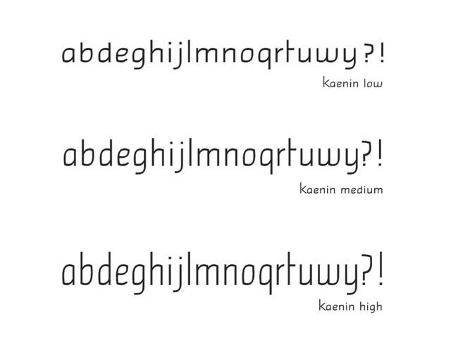
| 02 Express Depending on the person and the situation, the same written sentence is expressed verbally in various ways and tones. Kaenin is a font having three heights for adapting the tone and the rhythm of the speech to the visual form. | |
11 comments so far: read comments
 , please do comment
*verena -- Wednesday, April 28 2004, 10:58 am
hey bas, hey sami i KNOW you took some more pictures [and even movies] ;) i'd love to see those [at least the best ones]! would that be possible? greetings *v
Alessandro Segalini -- Wednesday, April 28 2004, 09:06 pm
Terve Sami, I much enjoyed the works, the concepts behind, kool like a viilipytty, I especially appreciate "Baseline," "Truth-semi-truth" cut out & "Baskerville emotions". -as8.it
pendragginink@yahoo.com -- Thursday, April 29 2004, 02:12 am
Love what you've done with your foreheads, crowns are passe' my dear, but this is a good look for you too. Pink is very big this spring. Are the dresses vinyl? does the green glow in the dark?
Pendragginink@yahoo.com -- Thursday, April 29 2004, 02:17 am
Hmmm. enter a comment on one page, and it is magically entered on all the pages---certainly a time saver. This dude here looks like he is havein a real time coping. not getting enough shut-eye, are ya honey. look, when this is a over and wrapped up, lets you and me go out to Elizabeth Ardens' and get you a make-over or somethin' because, honey, i mean----Dang!
pendragginink@yahoo.com -- Thursday, April 29 2004, 02:20 am
Alright. post-modernist symbolism here. wo-man, woman start out skinny and end up fat and droopy when all the proud curves fall to the floor. Surealism in its finest. What is scary is that i can actuall read the font. It could go on a cake frosting, or a 'cover-up' make-up line. Whatever.
Mother of all dragons -- Thursday, April 29 2004, 07:08 pm
Stereotype: An interesting presentation. Offers a choice of moods, top font looks reminds me of moonlight shadows on a wall, silent, still, with the anticipation of movement, something I would use to create a mood in a title. The middle font reminds me of a slogan written in a rush, on a wall, with a large brush with strong emotion...as in "Frodo lives!" or "La Raza!" The message is more inportant than the presentation. Id use it to get attention but on an announcement. The third font, on this scren, appears that the letters are flowing downward, as the paint is too thick or the letters are wax just beginning to soften, about to melt. the letters have more detail, not hurried, painted with the look of baving been done with a calligraphy pen and are part of the message, as in an advertisement. Are there uppercase letters as well?
Mother of all dragons An interesting presentation. Offers a choice of moods, top font looks reminds me of moonlight shadows on a wall, silent, still, with the anticipation of movement. The middle font -- Thursday, April 29 2004, 07:14 pm
The Face: sterotype of your average ax-murderer? or an ad for a new acne medication?
Mother of all dragons -- Thursday, April 29 2004, 07:19 pm
Screaming queens: this has got to be an ad in a teen style magazine. To introduce a product on the cutting edge of fashion, probably nail polish, eye make-up or prom dresses. Well done. The message is immediatly communicated to the viewer. at least it is in my realm. 257 teenagers (by actual count) said the same thing
---Lou -- Thursday, April 29 2004, 10:29 pm
Dear Mother of all Dragons, the Stereo-Types are very much in your debt. Thanks for taking so much care in looking at our font. Although I'm not sure when we'll get out of the utter confusion! I'll try and explain to the folks here. And let us know about the reviews of your 275 kids. Dragon kids? Ahéé' héé' the baby dragon
*verena -- Thursday, May 6 2004, 09:47 am
mother of all dragons, i love your comment , those are awesome interpretations of our font(s) it makes me think that they aren't TOO bad ;) greetings
Steve Behrens -- Thursday, March 17 2005, 11:08 am
Regarding Baskerville emotion: Affective characters like these are not only beautiful dingbats but could really gain popularity online and in other situations where type use is fluid. Some people certainly do love their huge variety of smiley faces, and interrobangs did seem to have a fanhood that appreciated the need for a punctuation mark combining question and exclamation. You would face the staunch opposition of the writing establishment, however, which is proud of writers' success thus far in expressing a huge variety of emotions with the traditional alphabet. So the best way to introduce them would be to make them optional for the reader. Online, in e-books, they could remain in a layer visible only to people who switch them on, like stage directions that are visible only in the script for the actors. They'd be very useful for closed captioning of TV programs, where the script is fixed and often ambiguous if you can't hear the interpretations. Perhaps there could be competitions to establish the idea of these auxiliary characters. They could be read like the markings on a musical score, suggesting tempos, emphasis, pauses, all sorts of dynamics.
 background information :
I have a question :
contact : browse :
site-map
background information :
I have a question :
contact : browse :
site-map |