|
typeworkshop.com home : type-basics : references : archive |
mailing list |

| workshops, Tampere 05 2003, daily |


background info |
|
|
|

day 1 : day 2 : day 3 : day 4 : day 5 final result thin group and tiny group

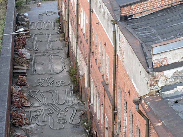
Last day, new day; sunshine and more bricks! The thin-group started the day with building the last word to finish their street lettering: don't feed the squirrel. The group was tired but motivated to finish their master-piece! We were also honoured to meet Mister Brick who came to give us a lection about bricks. "We want to thank you for lending us your bricks, Mister Brick!"
Because of the perspective, the lettering has to be viewed from a certain point: the balcony on the fifth floor. Posters and brick signs were made to tell people about the final product and to lead them to the balcony.
And yes, in the end we got together on the balcony. Our friend, the squirrel, wasn't partying with us - maybe he was offended of our sentence. Beer and nuts made the evening complete! It was fun, fun, fun... What could make the workshop better than hard work and a great end result!?!
Thank You! Tampere kiittää ja kumartaa!


 |  picture 6 of 12 |  |
And there it is, the final street lettering: 'Don't feed the squirrel'. Around 2147 bricks were used. | |

6 comments so far: read comments
 , please do comment
Bas -- Saturday, May 24 2003, 03:24 pm
Not to forget, put those bricks back again. Kiitos.
Ville -- Sunday, May 25 2003, 09:00 pm
Today we made Mister Brick happy and carefully stacked the bricks back into the neat piles. The squirrell doesn't have to worry too much about them either. What a shame though, it was such a wonderful piece of type :) Thank you Sami and Bas for sharing your knowlege and all these moments with us, take care and be welcome to give tampere another shot, let's make that type rock!
nina -- Friday, June 6 2003, 06:18 pm
hi hi, i was in the detroit workshop. this type looks awesome. im at work, bored as hell, and im loving looking at yer images. i wish that you all could embed a message permanently -- maybe at the school or something. hook up with a cement pourer (dont know the proper name)and see what could happen. awesome awesome job!!! so beautiful and interesting!
nina -- Friday, June 6 2003, 06:24 pm
and i only wish i could find such a sweet little squirrel friend ... ! i had one once, he was a bit chubby and ate vanilla wafers.
Kristen -- Saturday, June 21 2003, 09:33 am
the finished result is nice to look at from the shot above, i wish i could have seen it in person. the details are nice, i enjoy the peanut-like shaped Q the most, and it's interaction with the l, the top-heavy double r's are strong but seem overlooked next to the e, i love the srong contrast on the four strokes of the "f". what a playful experimentation in type design!
Buddy -- Wednesday, August 13 2003, 10:08 am
...

 background information :
I have a question :
contact : browse :
site-map
 |