|
typeworkshop.com home : type-basics : references : archive |
mailing list |

| workshops, Tampere 05 2003, daily |

background info |
|
|
|
day 1 : day 2 : day 3 : day 4 : day 5 final result thin group and tiny group
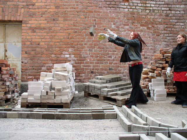
Bricks, bricks and bricks. The brand new gloves are already dirty. The thin group gathered to the alley in the morning and started tossing more bricks around. Blood, sweat and tears were not saved as the monumental lettering gradually appeared on the street. The group found themselves a mascot, a local squirrel that inspired the text. As a name of the font (family) was decided to be "Marthin" after Martin Luther, because of the protestant "hard working" approach to the type construction. Some work was still saved for tomorrow's pleasure.
The tiny group continued developing their font, after evalutuating yesterday's prints. All characters got modified a lot. And, of course, the spacing! In the end of the day a high resolution print was made, the only way to judge the type in 4 pts. or smaller. [To all (future) graphic designers in Tampere: this film was made with the very kind help of Repropiste. Thanks Repropiste!]. The print includes type setted at 12, 8, 6, 5, 4, 3, 2, and yes even at 1 pts. size! At every size it was compared with Times New Roman, to have a clue if we did a good job or not. And believe it or not, but you can read this damn typeface with your own eyes (without a lens) at 2 pts.! Yes. It works.
ps. Some pretended to be able to read this typeface even at 1 pts., but we were not for sure if we had to believe this.
 |  picture 3 of 12 |  |
8 comments so far: read comments
 , please do comment
akiem -- Thursday, May 22 2003, 07:11 pm
C'mon guys don't pull my leg. 1 pts type. You are joking?
Sami -- Thursday, May 22 2003, 07:23 pm
You don't believe us? Wait until we bring the hi-res prints to Den Haag! x-height in 1 pts is 0.15 mm and I could still read it without any optical lenses. Of course we had to face the technical limits of the printer's dpi-resolution and therefore it's distorted. But, I think we still didn't beat that Indian school boy.
chester -- Thursday, May 22 2003, 10:14 pm
Wow. Beautiful and smart. I'm in love... c
deeareen -- Friday, May 23 2003, 12:32 am
Maybe not totally related to this workshop, but I didn't find any better place to post these couple of links. This is bits and pieces of an experimental art form of ascii. Usually the fonts used here are very graffiti-influenced and that's why some people call ascii art as digital graffiti. You have to know the style before you can actually read what the 'design' says. Funny, huh? Anyway, here are the links: http://www.galza.tk http://member13.net/low_profile.gif Galza site is a bitch to use, but you'll get around when you use the arrows to move from an image to another and the ESC-key to go back.
akiem -- Friday, May 23 2003, 02:10 pm
Both projects look very good already. Perhaps it would be good to put a pdf of the tiny typeface online, so everybody can check the real qualities of his/her laser printer. Let's see which is the best printer when it's about small size. Brother, Epson, HP, Lexmark? Perhaps this typeface would be excellent for a printer-testing-page? By the thin group I like it a lot, that applying and designing the typeface comes together. I looks like fun & serious at the same moment. Therefore some questions to the tiny group: Why should I use such a small type-size (2pts)(? What should I print in such a small type? When? I would love to see some examples, that makes it obvious: type which can be set in 2 pts, is something that we really need. Examples, that show me, that I can not live anymore without such a typeface. Convince me. Please.
akiem again -- Friday, May 23 2003, 02:17 pm
After re-reading the explanation text on top, I am really very curious about seeing also Times in 1/2 pts. What happened with Times. I would like to see them compared next to each other. How do you compare the two typefaces. Is it just about as small as possible, or is it also about economy (wideness of the typeface)?
Bas -- Friday, May 23 2003, 03:50 pm
To give a small answer on your question Akiem, we only putted Times New Roman there to have a bit of a clue what we are doing. Of course there are much more and better typefaces to compare this new type with in small sizes. Don't take Times New Roman as the main reference point. This would need more time. But for the moment we are already happy if our typeface is as legible or more legible than Times. After that, there are still thousands steps to make. But yeah, time time time.
Akiem -- Friday, May 23 2003, 04:36 pm
So again another proposal for use: A proof-board for doctors, to check if people have good eyes. Specially for doctors with very small offices... Does this makes sense? How are your experiences. Was there really someone in the group who could read text set in 1pts ? Perhaps he/she should apply for the german TV show "Wetten das..."
 background information :
I have a question :
contact : browse :
site-map
background information :
I have a question :
contact : browse :
site-map |