|
typeworkshop.com home : type-basics : references : archive |
mailing list |

| workshops, Providence 03 2005, backgroundinfo |

|
|
|
Pieter van Rosmalen, CakeType
From: info@caketype.com
Subject: Re: Modular type workshop
Date: 9 maart 2005 19:29:17 GMT+01:00
To: bas@underware.nl
• Is making a modular typeface easy?
I think it's not very difficult. Of course some glyphs are more difficult than the other.
• Have you ever designed a typeface you consider to be modular?
Yes, if pixeltypefaces are also modular (I think they are).
• Modular typefaces seem to be something designers keep rediscovering. Why is that?
It's playing with shapes. Make the best readable glyph with the restrictions you created yourself using modular parts. And it's fun!
• What do you think the first modular typeface is?
Cassandra's typefaces? Don't know, can't help you with this one.
Groeten,
Pieter
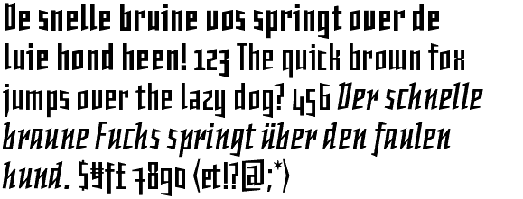
ps. Prozac is a nice example of a modular typeface. Not exactly like the assignment of this workshop, Barnbrook used 6 different forms.
Example of Prozac:
 |
Martin Wenzel, Martin Plus
From: martin@martinplus.com
Subject: Re: Modular type workshop
Date: 11 maart 2005 10:49:34 GMT+01:00
To: bas@underware.nl
• Is making a modular typeface easy?
I think it is, since most decisions are made before creating each individual character. Instead of having to make countless design decisions you can always apply the rules of your design system. The logical approach justifies the result. The more modules you have the more work it becomes.
• Have you ever designed a typeface you consider to be modular?
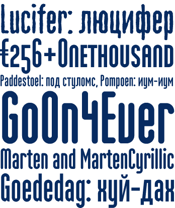
Oh yes: Marten, Daela and even Primary (see attached).
• Modular typefaces seem to be something designers keep rediscovering. Why is that?
Because we are practical (lazy): how much of a result can I get out of very little work.
• What do you think the first modular typeface is?
In the eighties Neville Brody made Industria (and other modular designs) which reminded me of typefaces from the twenties and thirties.
Gern geschehen,
Martin
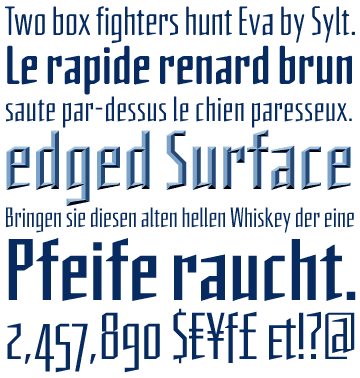
Example of Daela:
 |
Example of Marten:
 |
Example of Primary:
 |
Gerard Unger, Gerard Unger
From: ungerard@wxs.nl
Subject: Re: Modular type workshop
Date: 11 maart 2005 11:07:39 GMT+01:00
To: bas@underware.nl
• Is making a modular typeface easy?
This depends entirely on the modules. With a small number of modules it may be easier to make letterforms, but it will be less easy to create satisfactory letterforms.
• Have you ever designed a typeface you consider to be modular?
Yes, my Decoder is decidedly modular, and designs I have made for low resolutions I see as modular fonts.
• Modular typefaces seem to be something designers keep rediscovering. Why is that?
Type design is a profession with limitations. I guess type designers like to make things more complicated for themselves now and then, as a challenge, like chess players dream up impossible games you will never be able to end.
• What do you think the first modular typeface is?
Most probably the first alphabetic letterforms ever designed (Old Canaanite?) as these consisted of verticals, horizontals, a few diagonals and some curves. You cannot get more modular.
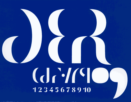
Example of Decoder:
 |
Christian Schwartz, Orange Italic
From: mrschwartz@orangeitalic.com
Subject: Re: modular typefaces
Date: 11 maart 2005 19:46:04 GMT+01:00
To: cyrus@fontbureau.com
Cc: bas@underware.nl
• Is making a modular typeface easy or hard?
Easy in the beginning, but some characters (especially S) take real ingenuity.
• Have you ever designed a modular typeface?
I think most typefaces are modular, to an extent. Shared forms for similar parts (the left stem of b h k l, the bowls of n and h, etc.) are what make most "normal" typefaces hold together in a cohesive way.
• What is the appeal of modular typefaces?
I think they're appealing because they give a peek behind the curtain, letting people who are not type designers understand how letters are constructed.
• What's the best modular typeface? Or the worst?
Eric Olson's FIG is a very funny take on what a modular typeface can look like.
www.processtypefoundry.com/typefaces/fig/index.html
Several of W.A. Dwiggins's typefaces are excellent examples of modular design, particularly Falcon. He liked to work by cutting stencils of his stem and bowl shapes and using them to quickly rough out the whole alphabet.
--Christian
Here are a couple of scans of Falcon:
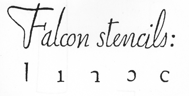 |
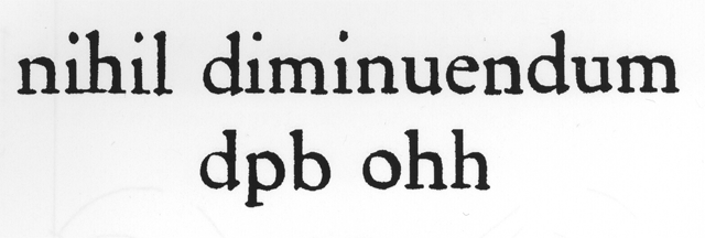 |
And also another example of a modular stencil made by Mr Dwiggins:
 |
Peterpaul Kloosterman, 2PK
From: peterpaul@2pk.nl
Subject: Re: Modular type workshop
Date: 14 maart 2005 13:29:16 GMT+01:00
To: bas@underware.nl
• Is making a modular typeface easy or hard?
Yes, comparing to non-modular typefaces. If you have the correct modules you can easily make characterforms. And you can forget the optical adjustments which you will have to carry out normally. That saves a lot of time!
• Have you ever designed a typeface you consider to be modular?
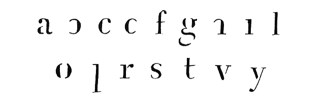
Yes, for practical reasons I made a simple and modular typeface: Perm (see first picture down here: lp-perm.gif). For carving letters into stone I made stencils of modules (see second picture down here: sjabloon.jpg). So you can easily draw the outlines of Perm on the stone (see third picture down here: letterscursiefproeven.jpg).
• Modular typefaces seem to be something designers keep rediscovering. Why is that?
People love to rediscover old practises and re-use them. And it can be very useful to solve practical problems.
• What do you think the first modular typeface is?
Surely it must be a long time ago...
Succes en groet!
Peterpaul
Example of Perm:
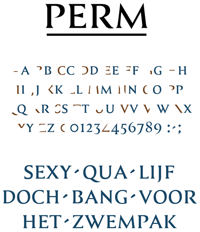 |
Picture of the stencil-modules:
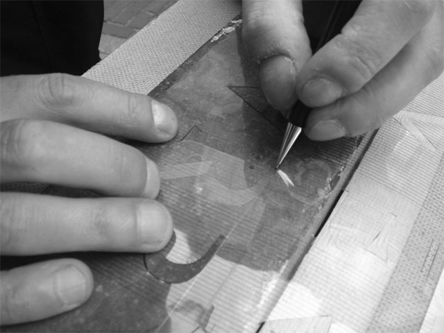 |
Picture of final stone cutting:
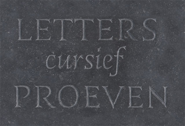 |
Mike Cina, WeWorkForThem
Date: 3/14/05 8:51 PM
Received: 3/14/05 6:51 PM -0800
From: cina@weworkforthem.com (WeWorkForThem_Cina)
To: cyrus@fontbureau.com (cyrus highsmith)
• Is making a modular typeface easy or hard?
It depends on how easy or intricate you want to go on the faces. They can be very easy if you don't put a lot of work into them. When I first started, I would draw letters that were very consistent and had a strict look and feel. No variation from the overall aesthetic, then I learned that there were an unlimited amount of results and that lead me into drawing over 1000 characters for a single typeface. I never could put all the ideas in one face so I would pick the most legible and unique characters. Often editing out letters with great personality. I still am attracted to geometric faces but I try and take them a lot further and that takes more time and effort than I have at the current time. A good typeface is only as good as the amount of time you wish to put into it, geometric or otherwise.
• Have you ever designed a modular typeface?
Almost all of my typefaces are modular in some way, shape or form.
• What is the appeal of modular typefaces?
Modular typefaces have always been something that attracts people who are methodical in their nature. Herbert Bayer and Laszlo Moholy Nagy had some great ideas on modular typefaces that are still relevant in some fashion today. Designers like Wim Crouwel and Gerard Unger dropped some heavy geometric faces.
I think that people like organization and structure to some degree. Most traditional typefaces rely on consistent elements to create a balance and flow. Personally, I like sticking to an exact grid and not wandering too far from it. Anything can be created using a good system or idea to start with.
• What do you think the first modular typeface is?
No idea. To me, the first modular typeface would be some of the early Bayer experiments. Those had very distinct modular aspects to them. I remember looking at them in college and thinking that he was a genius. Those Bayer typefaces weighed heavy on me. When I started creating modular typefaces, I thought I was doing something semi-original in my designs, only to find out that people like Wim and Gerard had done very similar faces. I always say "I am first to do something second."
Michael Cina
WeWorkForThem | http://www.weworkforthem.com
YouWorkForThem | http://www.youworkforthem.com
&
TrueisTrue | http://www.trueistrue.com
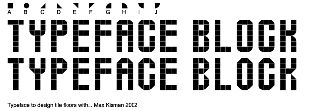
Max Kisman, Holland Fonts
From: maxk@maxkisman.com
Subject: Re: Modular type workshop
Date: 16 maart 2005 21:51:13 GMT+01:00
To: bas@underware.nl
• Is making a modular typeface easy?
It might be, it is or it can be. But there are always some complications.
Hardest part is its concept. For what purpose does it meed to be modular. The idea of modularity can stretch into many directions. For instance will you apply modular on modular parts to construct the individual letter forms of the alphabet. Or do you apply modular on the use of the letter forms to construct a modular appearance of its use.
• Have you ever designed a typeface you consider to be modular?
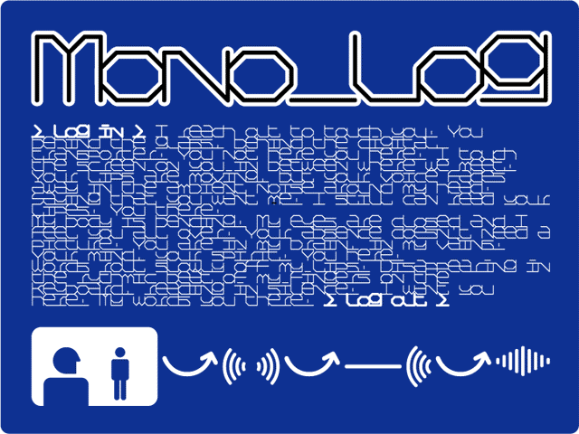
I have made some attempts and experimented to make a modular system to create individual letterforms, as a basis for letter forms, as well in systems wich purely create visual textures. A few of my fonts, that are mono spaced, I consider modular, because they allow you to construct visual textures rather thanlegible texts. In an attemt to combine the two I created a font called Mono Talk, where all letterts are continually and constantly connected.
• Modular typefaces seem to be something designers keep rediscovering. Why is that?
Modular systems provide little and simple building blocks to create larger and complex constructions. It's like a puzzle.
• What do you think the first modular typeface is?
I would say the Cuneiform scripts. If we consider it as a typeface...
Other more recent examples that appeal much to me are Wim Crouwel's New Alphabet (Quadrat/Steendrukkerij de Jong 1967), many of Jurriaan Schröfers modular lettering systems (see Letters op Maat, Lecturis 1987), Timothy Epp's alphabet (Quadrat/Steendrukkerij de Jong 1970), but also Doesburg of De Stijl (see its logo on the magazine) and Gerard Unger's Decoder for Fuse (1991)
Example of Monolog:
 |
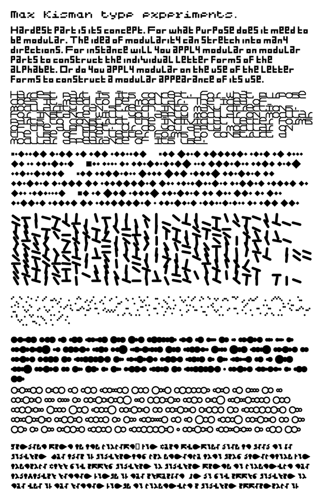
Some type experiments by Max Kisman:
 |
 |
Example of a simple basic for a modular type:
 |
Some other examples of modular type:
Casasin workshop
Fuse projects like White no sugar : and what about this?
Supervelozz (info)
Mata Hari by Max Kisman
Briem: Type made in one day and then polished.
Various ways of sketching type (not modular based however)
Start your own research before the workshop begins. All research results will be added here.
1 comments so far: read comments
 , please do comment
 background information :
I have a question :
contact : browse :
site-map
background information :
I have a question :
contact : browse :
site-map |