|
typeworkshop.com home : type-basics : references : archive |
mailing list |

| workshops, Helsinki Lahti 10 2002, 06 |


the fatter the better basic info : presentation half way :

Assignment
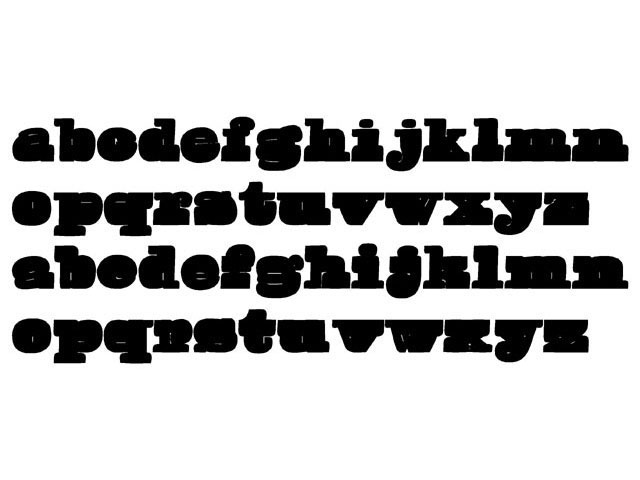
Study the ultimate boldness of a type. Make the fattest type in the world. How fat can you go? The fatter the better!
Process
We found out that the blackness of fatness is about ratios. A bold type is bold only when it's compared to the regular cut. How about really fat one? A black square does not look fat or heavy, but when you have some small details which you can compare the huge black mass, the heaviness can be accomplished. So it's all about contrast here.
Our starting point was claredon. The next task was to find which parts of the letters could be made fatter. We did not want take the obvious route to just make the wider parts of the letters even more fatter or just to expand the whole letter. Instead we decided to figure out the essential parts of the letters and expand just those. That way the nonessential parts could be expanded to such extremes that they are not recogniseable any more. Finding the essential parts could have been the theme for the whole workshop so we used and existing implementation called Canyon. Also we found out that we could make two versions, upper fat and lower fat by just making the opposite parts fatter. The resulting typeface at this point was very ugly and not as fat as it could have been. We decided the make the type better and fatter on the second part of the workshop. The first version was used as skeleton for the new fatter one. After all it was a good decision, since some usual problems got solved making the first version.
Final Solution
Even the first type was based on Clarendon we found out that I would be more interesting to use the new type just as a starting point and let the design find it's shape freely. From the early days of the workshop we had this idea that we absolutely should bake the letters at some point. The final type is a fat font with very tiny inner forms. The idea of baking indirectly influenced the forms of the letters absolutely, even it was not studied before the final letters were done in Fontographer. The minimun size to use the type is 180 points. Below that the inner forms are very unpleasant. The type works best on very large sizes and short words. More than six letters is way too much. With slight modifications the type could be applied in to a baking mold.
download booh_fat_sheet.pdf


 |  picture 9 of 11 |  |

9 comments so far: read comments
 , please do comment
Sami -- Thursday, October 24 2002, 10:55 pm
Give me more cookies.
Bas -- Thursday, October 24 2002, 11:26 pm
Lots of energy in this type! Tip: print the PDF file and print it at home big, bigger, huge size on your own printer.
Hrant H Papazian -- Friday, October 25 2002, 02:27 am
Tasty! Almost as fat as FF Extra, but much more legible. hhp
Akiem -- Friday, October 25 2002, 10:13 am
You want more cookies? > http://www.euronet.nl/~kabk/pages/vgko_spcl/2.html Yes, this is very old, and the link is not working anymore. Sorry. Please use this link: http://www.euronet.nl/~kabk/pages/vgko_spcl/CAKE.dcr
hugo@visionandfactory.com -- Friday, October 25 2002, 03:55 pm
Is that what you guys call fat? Probably the Finnish people are too healthy to know what "fat" really is. Probable the Americans would do these job much better. However I do like the cookies, I suppose they were just regular before they went into the oven. What's the price of this whole family? Is there also a bold italic/small caps available? Best regards Hugo Puttaert http://www.visionandfactory.com
Jan Middendorp -- Friday, October 25 2002, 04:10 pm
A bible type for fundamentalists! The idea of mixing two versions, top-heavy and bottom-heavy, is great. I'd like to see an alternative, though, with a little more white inside. When the counters almost dissappear like they do here, the impression of fatness does not become stronger, but weaker. The fatness becomes a disease, not a peronal decision. So if you'd allow the characters to open their eyes just a little more, you might see that they are just a fat, but more natural. But I guess that with this comment I am *really* late.
Bas -- Tuesday, October 29 2002, 01:40 pm
You're right Jan. A second version would be nice, with bigger counterforms. This group had an idea to make a second version with more white inside, the current font can only be used at 180 points or more. But unfortunately there was no time for this other version during the workshop. Time is limited.
ed -- Wednesday, October 30 2002, 10:25 pm
well, it's fattening allright. I would love to taste it alongside my pts. Furthermore, my love for the Giza is not in any danger at all.
Ria -- Friday, December 6 2002, 04:11 pm
Fat can be beautiful. For fat to be beautiful it requires clarity and distinctive style. This counts for humans, food and fonttypes. JanM's comment makes sense. I wish you fontjunks lots of fun.

 background information :
I have a question :
contact : browse :
site-map
 |