|
typeworkshop.com home : type-basics : references : archive |
mailing list |

| workshops, Tampere 05 2003, daily |
background info |
|
|
|
day 1 : day 2 : day 3 : day 4 : day 5 final result thin group and tiny group
The tiny-group went nuts with their font. Because the other group was dedicating their project to the squirrel, this group called their font 'Nuts' and presented this in a little booklet about the squirrel who doesn't get feeded anymore. On the last day of the workshop another high resolution film was made in the morning. Based on yesterday's film, some corrections have been made to the font. Is it legible in small sizes? Yes. Could it be more? Probably, but time is killing us. We have to put the font to an end and start presenting it.
A very tiny 16 page booklet was made, not only to present the 'Nuts' font, but also to tell some personal experiences of the local squirrel. And a cute mascotte for this whole workshop was made. You wanna know all about the squirrel? Here is a PDF which tells the real story. Try to print it at your own printer, and see if your printer can handle this type at 3 pts.
It was a long long day, the books got finished at nine o'clock in the evening; time for pizza, beer and of course some nuts!
 |  picture 1 of 12 |  |
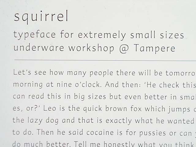
Detail of the high resolution film which was made on friday morning. The text at the bottom is originally set in 18 pts. | |
2 comments so far: read comments
 , please do comment
Sami -- Saturday, May 24 2003, 03:29 pm
Thanks for all. I'm looking forward to see how italic, small caps and bold will look like! Ah, we also numbers.. and some caps are missing... :)
Der Herr Hopstock -- Tuesday, May 27 2003, 12:28 pm
Dear Tinythins and Underwarers, i just seen your workshopdocumentation and thought i send you a sample of something i made (pdf: click here). It is acctually fitting to the tiny and the stencil workshop-group you had recently. Its called ultimate because its supposed to be the ultimate reduction for a stencil-kind of type. I send a sample of the typeface as pdf. I made in a few hours so there will still be some changes. For example i will change the small "t" to be more different from small "k" and do some changes on "v", and "w" and maybe "A". I tried to reduce the lenght of stripes as much as i could but i think there has to be one more smaller one. It size is going to be the counter of a vertical stroke of "a,e and s" (all same size). It original purpose is not for screen or print but tape to put on the wall. so the digital typeface will be just a testing vehicle. maybe you find it inspiring - please tell me also what you think if anything comes up. Greeting to all - Till
 background information :
I have a question :
contact : browse :
site-map
background information :
I have a question :
contact : browse :
site-map |