|
typeworkshop.com home : type-basics : references : archive |
mailing list |

| workshops, Tampere 05 2003, daily |

background info |
|
|
|
day 1 : day 2 : day 3 : day 4 : day 5 final result thin group and tiny group
Bricks, bricks and bricks. The brand new gloves are already dirty. The thin group gathered to the alley in the morning and started tossing more bricks around. Blood, sweat and tears were not saved as the monumental lettering gradually appeared on the street. The group found themselves a mascot, a local squirrel that inspired the text. As a name of the font (family) was decided to be "Marthin" after Martin Luther, because of the protestant "hard working" approach to the type construction. Some work was still saved for tomorrow's pleasure.
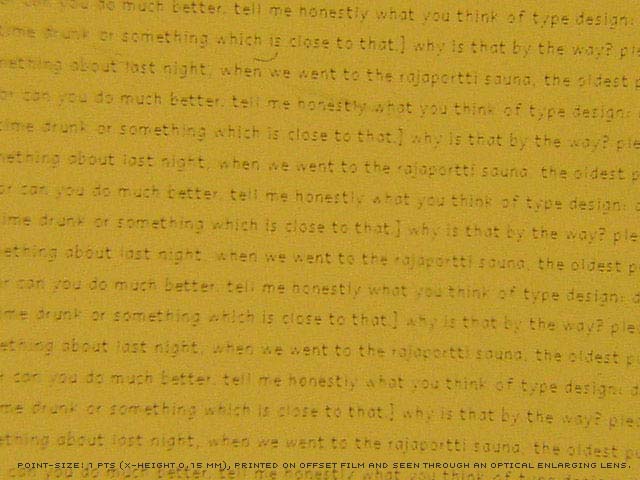
The tiny group continued developing their font, after evalutuating yesterday's prints. All characters got modified a lot. And, of course, the spacing! In the end of the day a high resolution print was made, the only way to judge the type in 4 pts. or smaller. [To all (future) graphic designers in Tampere: this film was made with the very kind help of Repropiste. Thanks Repropiste!]. The print includes type setted at 12, 8, 6, 5, 4, 3, 2, and yes even at 1 pts. size! At every size it was compared with Times New Roman, to have a clue if we did a good job or not. And believe it or not, but you can read this damn typeface with your own eyes (without a lens) at 2 pts.! Yes. It works.
ps. Some pretended to be able to read this typeface even at 1 pts., but we were not for sure if we had to believe this.
 |  picture 12 of 12 |  |
8 comments so far: read comments
 , please do comment
 background information :
I have a question :
contact : browse :
site-map
background information :
I have a question :
contact : browse :
site-map |