|
typeworkshop.com home : type-basics : references : archive |
mailing list |

| workshops, Tampere 05 2003, daily |

background info |
|
|
|
day 1 : day 2 : day 3 : day 4 : day 5 final result thin group and tiny group
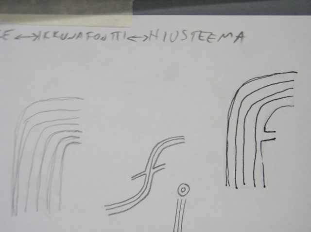
So, what happened today? Take a look at the pictures; on the top row you see the sketches from thin group and on the bottom row the work from tiny group. Take care, this order will stay also during the following four days.
Tiny group took a look on the problems by first printing existing types into very small sizes, 1-5 pts size. By doing the sketches it became clear that this group still needs to solve many aspects: what to do for the spacing, the thickness, what about the serifs (?), and the contrast (?) and for the counter forms. Brrr.
Thin group's problem is more conceptual. One of the strongest ideas of today was to make a lettering for the hairdresser's window using 'hairlines'. How that type should look like was still a mystery. Yes, we have to sketch more and find a form of a typeface which cannot exist in a bold version. And keep on thinking in extremely big headline sizes of course.
 |  picture 4 of 12 |  |
6 comments so far: read comments
 , please do comment
Lucas Nijs -- Tuesday, May 20 2003, 02:45 pm
In a previous life I had to redraw logos from sigaret brands to be printed on the sigaret paper (since then I'm a heavy non-smoker!). The rule to follow was extremely simple: everyhting has to be exagerated while keeping in mind that the sigaret paper was sucking a lot of ink. Openings had to be bigger. Where 2 lines meet you need extreme optical correction. I hope this may help the tiny group. For the thin group: we had a student who made a typeface with her hair. It was presented between glass plates as a medical item. If you want I can send you a picture (I have to look it up in the archives) good luck with the workshop, lucas e.media@skynet.be
akiem -- Tuesday, May 20 2003, 02:47 pm
What to say? It is always very hard to say something which is just starting. But someone has to start, so... It looks promising, that there are different designs, with different ideas. I like this. Working together in one room, being busy with the same assignment, can easily bring lots of similar ideas. But this is not the situation, as far as I can see. I like the modulation (thick/thin) of the lowercase 'e' in the top row second from left. By making it thick on bottom and top, it has a relation with western-type... The drops look to important to me. They want to get all the attraction for themselves... The lowercase i looks a scared getting smashed from it's own dot... ughh Also the f looks scared, loosing its 'top-arch' from carrying this heavy drop... Alles geben, Akiem
Sami -- Tuesday, May 20 2003, 02:48 pm
Lucas, yes just if you have some time to browse through your archives, do it. Easiest is of course to make a link to the original site, if that exists, then we don't only copy-paste your picture but keep it in its original context.
Joanca -- Tuesday, May 20 2003, 02:50 pm
Regards, good luck and keep on the cool work!
Monique -- Tuesday, May 20 2003, 04:41 pm
I am enjoying the second from the left (top row) I like the length of the "f" and the decender on the "n". Reminds me of little weights forming the letters through gravity. I also like the 4th from the left (bottom row), The curves are very nice, really like the "a". Looking forward to the final font, the project sounds challenging.
Hanna -- Tuesday, May 20 2003, 05:31 pm
The third picture on the top row looks interesting. How to keep a very narrow typeface legible? The counters are important, and I think this upper-case a in between works better than if it had been a lower case a. The "middle bars" of the f and the a are important to bring some verticality to the characters and maybe there should be more attention to these vertical parts. Maybe, after all, the letters should be slightly wider? I´m just thinking at loud... Have fun :O)
 background information :
I have a question :
contact : browse :
site-map
background information :
I have a question :
contact : browse :
site-map |