|
typeworkshop.com home : type-basics : references : archive |
mailing list |

| workshops, Helsinki Lahti 10 2002, 03 |

bible type basic info : presentation half way :
Latest news: nothing's gonna stop them now - click here to see more
Started with a research on existing typefaces, meant for small sizes, long running text, highly economical, which are well readable but still save lots of space.
Then started to create an own typeface, but not starting from scratch. The starting point was a Bodoni, and then to see which aspects had to be changed to make it more appropiating for our goal.
Ascenders and descenders could be shorter, less contrast was made, forms of the serifs were adapted, and most of the characters were made more narrow to make the font more economical.
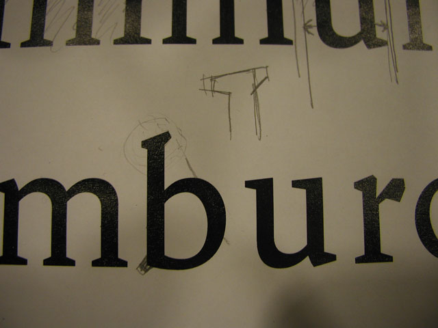
Tension in the curve of the b was researched then the next day, together with the tension in the shoulder of the n. Also the form of the serifs and the overall feeling of the type were considered. Meanwhile a new type started to be created, with almost no relation at all with the original Bodoni.
After deciding the most basic features of the typeface, some other characters were created with the same appearance as the original n and b. This makes testing in small sizes possible, with some words, and makes it possible to compare it with the original starting point. Is our version so far better or not? Did we take the right decisions, or do we have to reconsider our decisions again?
Right or wrong, hard decicions were taken, but let's go to develop the whole hamburerfontstiv to see how it works, and after we will work with g, and capitals, and numbers... in Lahti!.
 |  picture 3 of 10 |  |
3 comments so far: read comments
 , please do comment
Bas -- Wednesday, October 23 2002, 07:21 pm
Guys guys guys, it looks like I cannot stop you anymore...
Hrant H Papazian -- Thursday, October 24 2002, 01:08 am
I'm keeping my eye on this one - I love this style of type (which I think is becoming a new trend) almost as much as I love chocolate.
Those "Latin slab" serifs are so honest, and the unexpected angles are wonderful. Please, don't end up "homogenizing" it too much, divergence is such a valuable scarcity.
hhp
BibleFontTeam -- Thursday, October 24 2002, 09:44 am
Hi Hrant!
thank you very much for your contribution. Your comment encourage us, you must know that it is very difficult take some decisions with regard to serifs and details which give personality to the font.
So we understand this unexpected angles as something valuable, not to be corrected.
And maybe g is coming soon...
Kiitos from Finland!
Susana, Heikki, Hanna, Kirsi
BibleFontTeam
 background information :
I have a question :
contact : browse :
site-map
background information :
I have a question :
contact : browse :
site-map |