|
typeworkshop.com home : type-basics : references : archive |
mailing list |

| workshops, Rovaniemi 12 2003, daily |

|
|
|
day 1 : day 2 : day 3 : day 4 final result LED-group : Biggest group : Face-the-light group
Renaissance to Rene-Sans.
It really took some work but in the end we made it. And it works too! The first idea was about the ideology of Renaissance, to bring light to the dark ages. Light is not always visible. It can also be an inner light, the idea of light in an object.
The font making process with a group of ten or so people turned out to be quite a challenge. The road from the beginning to the end was long and at times we thought we were completely lost. But we made it to the end. Kill your darlings! That was our way to go. Our thinking and sketches went from renaissance to gothic to 80's new romantics and back. But once we finalized our basic forms we really started to get things going.
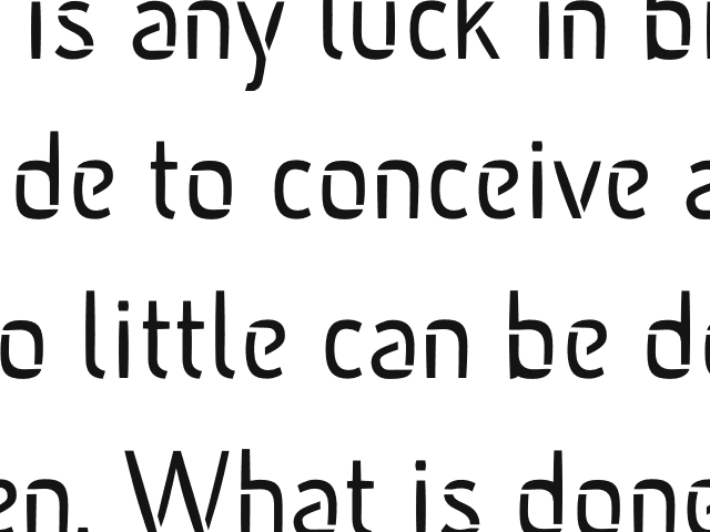 |
To us the final result seems quite solid and with clear form language. The stencil style font served our final presentation well. Our advise to you is to face the light and just let loose!
ps. If you wanna have a closer look on Rene-Sans, check this PDF.
 |  picture 5 of 6 |  |
2 comments so far: read comments
 , please do comment
Jan Rudkiewicz (jan.rudkiewicz@hasanpartners.fi) -- Monday, December 15 2003, 12:00 pm
Hello Underware!!! nice workshop guys. funny and interesting idea - shiny type - and really nice works. it's great that you keep organizing these workshops. made me jealous of being a student. the website of the workshop is also really good, showing the whole process of working with pictures. nice work... greetings from helsinki! jan
donald beekman -- Wednesday, December 17 2003, 02:18 pm
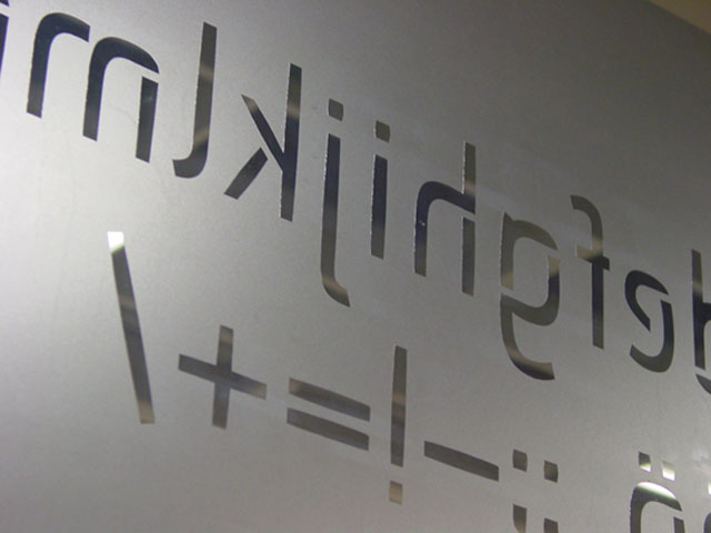
hi everyone GOODPOINT: of coarse it had to be LEDs, and only LEDS! i am impressed how elegant the font looks, despite its limitations (dots). really excellent work! i would love to see some Caps too! BENDOVER: sehr sehr cool, i like how the letters bend around the building and change shape when projected! interesting thickness changes within the characters. Very curious how the caps would look too! RENESANS: very nice font indeed, subtle. especially considering the struggle you have had with the concept. it is a beautiful font, i can easily see it used in airport sliding doors. hope you will keep on designing fonts! good luck! donald beekman - [DBXL] http://www.dbxl.nl
 background information :
I have a question :
contact : browse :
site-map
background information :
I have a question :
contact : browse :
site-map |