|
typeworkshop.com home : type-basics : references : archive |
mailing list |

| workshops, Detroit 04 2003, daily |

american-stencils background info |
|
|
|
day 1 : day 2 : day 3 : day 4 : day 5 : day 6 : day 7 : final result
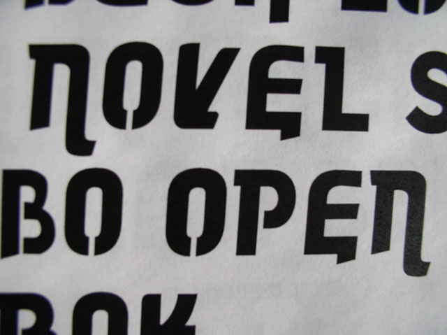
10 million points!!! The fourth day began by placing individual characters created by each student into Fontographer. A discussion took place on the proper techniques and adjustments of letterform structure and spatial relationships between letters. With this in mind, students then revised their characters to create a more unified alphabets. For tomorrow each students works on their specified letters and makes at least 20 correction notes to the print outs! Yes, we also should start to think about the name (really important!) and a final use for the type. Some students will create the missing letters as well as ornamental elements to work along the type.
 |  picture 14 of 18 |  |
9 comments so far: read comments
 , please do comment
type_hizzo_shizzo_rock_dizzo -- Thursday, April 10 2003, 04:36 am
These typers really know what they are doing. I want the "flying fabulouso type graphers extrodinary carnival of sin" to come to my town. I think the the final typer font should be put on the dollar bill.
type assassin -- Thursday, April 10 2003, 08:14 am
The font is beginning to take form, while it is evolving it still maintains some characteristics of the chosen font from the second day. The process so far has lead to a nice team effort in which everyone has had some form of input to effect the final outcome. It will be nice to view the next step when the font becomes more uniform.
Bas -- Thursday, April 10 2003, 11:11 am
The overall feeling looks quite strong to me and also still very playful, which is good. Would there be an option to make two versions for every character? One which could be putted in the uppercase slot, and one in the lowercase slot? Would be cool of course. But, time, time, time... I think that the strenght and power which is in the 'M' or in the sketch of the '8' for example, is not yet in other characters like the 'E', 'G' or 'S'. They could be more outspoken! Also, try to print them already now big and put them on the wall again. I think some characters like the 'X' will never ever look like an 'X', but more like a 'K'. Next to this I agree with Chester, the inner forms which are only connected at the bottom could be extremely hard to stencil. For example in the '8' and in the 'B' or 'O', even the 'N' maybe. Is there any idea already which material the final font will be realised? [brrr, it's damn cold in Holland]
Bas -- Thursday, April 10 2003, 11:17 am
o ja, what I forgot to say, the rythm of a line of text gets disturbed by some characters. Characters like 'M' and 'N', but also like 'O', make sure there is a very strong repetive rythm in a line of text. But characters like 'S' interrupt in that balance. Maybe they should have a much more vertical stress, or vertical optical balance (aah, fuck, very hard to explain by mail. Shit, I hope you understand what I mean...)
Jürgen Weltin -- Thursday, April 10 2003, 02:11 pm
It's taking shape, great! I like the sketch of the '8' very much. Unfortunately, the digitized version lacks the vitality of the sketch. The sketch is much stronger. I'd like to see more of this as an overall concept for the whole alphabet. It has an interesting feature that i miss in the other letters. Why don't 'N' and 'M' (and various others) have the break like 'T' has? 'S' ist too quiet, 'K' is too freaky, 'A' is good. Don't cry - work! And have fun :-)
DJ Karina -- Thursday, April 10 2003, 05:16 pm
Wow this type is really looking great, lots of progression as well, when I look back on day one! I like that the type is solid but has swashes as well! I am not a big type expert but it's really standing on itself, good job! The name of the type shouldn't be hard. Hamburger Italic or Steak Bold sound OK to me : ) And Akiem: Alles Geben, Ciao
Bas -- Friday, April 11 2003, 10:11 am
Name of the typeface Hamburger? Gettyburger you mean...
Hugo -- Friday, April 11 2003, 02:38 pm
Looking hebrew, should be decided if to continue with more fluent shapes like "S" or more modular, now is something in between. it has a strong apearence as a stencil should have, I agree Bas, contrast can cause problems in a stencil if it's going to be "punched" (and that is the main reason to make a stencil or not?) Akiem, where's the party? Alles Gebe!
Hugo -- Friday, April 11 2003, 03:38 pm
Sorry Akiem, I mean "Alles Geben" of course... and maybe "modular" is not the right word but yeah... Also the "stencil look" can be of course just a feature of type for print only. I remember fade@denhaag had really nice stencil "Fraktur" that would have been hell to punch because of the high contrast...
 background information :
I have a question :
contact : browse :
site-map
background information :
I have a question :
contact : browse :
site-map |